

In 2026, the transition to Mobile-First Indexing is no longer an impending roadmap milestone or a gradual migration initiative—it is the absolute, uncompromising reality of global search. Google has officially retired desktop Googlebot for primary search indexing. For every website on earth, Googlebot Smartphone is now the sole, authoritative crawler that dictates whether your pages exist in the index, how they are understood by semantic neural networks, and where they rank on search engine results pages (SERPs).
Yet, across enterprise organizations, e-commerce platforms, and publishing networks, engineering and marketing teams continue to suffer from a dangerous architectural cognitive bias: they design, write, test, and approve web pages on expansive 27-inch 4K desktop workstations, while Google evaluates their website as a resource-constrained, touch-driven, low-bandwidth smartphone.
This desktop-first complacency produces silent, catastrophic ranking penalties. Even when a website appears visually "responsive" on a modern iPhone, hidden technical discrepancies frequently cripple its organic visibility. Mobile DOM content omissions, JavaScript hydration bottlenecks that exhaust mobile rendering budgets, lagging Interaction to Next Paint (INP) latency, broken schema synchronization, and intrusive mobile viewport shifts quietly decimate search performance.
If your mobile organic traffic has plateaued, if your new pages linger in indexation purgatory, or if your mobile search visibility lags behind your desktop analytics, your site is failing Google's 2026 mobile-first indexing standards. This comprehensive engineering guide is an exhaustive technical manual and diagnostic playbook. Spanning DOM parity audits, client-side rendering costs, Core Web Vitals optimization, responsive media architecture, automated CI/CD testing pipelines, and a 20-point pre-flight scorecard, this guide ensures your web infrastructure is fortified for the mobile-only search era.
Chapter 1: The 2026 Mobile-Only Reality: Why Desktop Optimization is Obsolete
To audit your website effectively, you must understand the complete timeline of Google's indexing infrastructure. When Google initially announced Mobile-First Indexing in 2016, the system operated on a hybrid model: sites were evaluated individually, and desktop crawling served as a reliable fallback. Over the subsequent decade, mobile traffic exploded to surpass 68% of global web queries (and upwards of 82% in retail, local services, and consumer technology).

Today, the hybrid model is dead. Googlebot Smartphone is not merely the "preferred" crawler—it is the only crawler that builds the primary search index. When a user conducts a search on a desktop computer, Google does not query a desktop index; it retrieves rankings, snippets, cached text, and structured entities derived entirely from how your site rendered on a simulated mid-tier mobile device (specifically, an emulated Android smartphone running an evergreen headless Chromium browser).
The Two-Wave Indexing Pipeline & Mobile Rendering Budgets
Google indexes the web using a sophisticated Two-Wave Indexing Architecture. Understanding this pipeline is vital for every web developer and technical SEO:
- Wave 1: Immediate Crawling & Server-Rendered HTML Parsing — Googlebot Smartphone requests the URL via HTTP GET, downloads the raw server-rendered HTML payload, parses static text, discovers internal links, and passes the static document to the indexing pipeline within seconds. If your primary content, canonical tags, and metadata are embedded directly in the initial HTML response, they enter the index immediately.
- Wave 2: Web Rendering Service (WRS) Queue — If your page relies on client-side JavaScript (React, Vue, Angular, Next.js client hydration) to generate content, the URL enters the WRS rendering queue. Because rendering millions of JavaScript web applications requires vast GPU and CPU compute power, Google defers this step. The delay between Wave 1 and Wave 2 can range from several hours to over two weeks depending on your domain's crawl budget and server response speed.
Crucially, inside the WRS, Googlebot Smartphone emulates a budget-constrained mobile CPU on a throttled 4G cellular connection. If your JavaScript execution takes longer than 5 seconds, if your scripts trigger endless micro-tasks, or if your memory consumption spikes, Google's headless Chromium instance aborts execution, snaps a partial DOM snapshot, and indexes whatever incomplete content was rendered before the timeout.
Never assume that content missing from your mobile template will be indexed because it exists on your desktop template. If an entity, paragraph, internal link, or data table is omitted from your mobile viewport, Google treats it as non-existent for your entire domain across all devices.

Chapter 2: Mobile DOM Parity: The Fundamental Pillar of Search Visibility
The single most destructive error engineering teams make under Mobile-First Indexing is breaking DOM Parity (Document Object Model Parity). In traditional desktop-first responsive design, front-end developers frequently used CSS utilities like class="hidden md:block" or JavaScript conditionals (if (window.innerWidth < 768)) to prune "cluttered" content from mobile screens.
When you hide content on mobile viewports, you are not merely cleaning up the mobile user interface—you are permanently removing that content from Google's search index.

The Seven Non-Negotiable Elements of Mobile DOM Parity
To ensure 100% indexing parity between viewports, audit every template across these seven architectural layers:
- Primary Textual Content: Every heading (H1–H6), body paragraph, feature bullet, and technical specification present on desktop must be present and fully rendered in the mobile DOM. If you hide secondary descriptions on mobile e-commerce category pages to save vertical space, Google stops ranking those categories for long-tail search queries.
- Internal Link Architecture & Navigation: Internal links pass PageRank equity and topical relevance throughout your domain. On desktop, sites frequently display rich megamenus, contextual sidebar links, and expansive footer directories. If your mobile hamburger menu truncates subcategories, or if your mobile footer eliminates contextual links, those links cease to pass SEO authority anywhere on your site.
- Structured Data (Schema.org JSON-LD): Schema markup must be 100% identical on mobile and desktop. E-commerce sites frequently inject Product, Review, and Breadcrumb schema on desktop, but omit them on mobile to shave kilobytes off the payload. Googlebot Smartphone will fail to validate the schema, stripping rich review stars, price badges, and in-stock carousels from search results.
- Metadata & Open Graph Tags: The
<title>,<meta name="description">,<link rel="canonical">, andhreflangannotations must match character-for-character across all viewports. - Image Alt Attributes & Captions: Every visual asset that carries semantic meaning must have identical
alttext on mobile viewports. Furthermore, ensure mobile images do not link to low-resolution thumbnails while desktop images link to high-resolution master assets. - Interactive Elements (Accordions & Tabs): Content hidden behind user-initiated UI toggles (such as expandable FAQ accordions, "Read More" disclosure buttons, or tabbed product specifications) is indexed by Google, provided it exists in the rendered HTML DOM. However, if that content is only loaded asynchronously via AJAX upon user click, Googlebot will never see it.
- Robots Directives & Canonical Tags: Ensure your mobile pages do not serve conflicting
<meta name="robots" content="noindex">tags or canonical URLs that point away from the authoritative self-referential target.
While content wrapped in display: none within an accessible accordion will still be indexed by Googlebot Smartphone, content completely omitted from the HTML stream by SSR or React component rendering is lost forever. Always inspect the raw mobile HTML source and the rendered DOM in Google Search Console's URL Inspection Tool.
| Page Element | Desktop Template | Mobile Template | SEO Indexing Impact in 2026 |
|---|---|---|---|
| Category Description Text | 800 words with rich entity keywords | Hidden via JS / Omitted | Severe Ranking Drop: Google indexes zero words of description text. |
| Subcategory Megamenu Links | 45 contextual internal links | Truncated to 8 top-level links | PageRank Starvation: Deep category pages lose crawl depth and link equity. |
| Product Review Schema (JSON-LD) | Full AggregateRating markup | Stripped to reduce mobile HTML size | SERP Rich Result Loss: Review star ratings completely removed from search results. |
| Tabbed Technical Specifications | Present in CSS tab container | Rendered in HTML <details> accordion | Full SEO Parity: Indexed 100% as long as text is in initial DOM. |
Chapter 3: The Core Web Vitals Triumvirate for Mobile
Since Google incorporated Core Web Vitals (CWV) into its Page Experience ranking signals, performance optimization is no longer just a technical luxury—it is an algorithmic necessity. Crucially, Google collects Core Web Vitals data via the Chrome User Experience Report (CrUX), which aggregates real-world field telemetry from millions of actual mobile users on cellular networks.
A website that scores 98/100 on desktop PageSpeed Insights frequently scores below 45/100 on mobile. The reason? Mobile devices have slower single-core CPU speeds, aggressive thermal throttling, and high-latency cellular connections (4G/LTE latency fluctuations). If your mobile site stalls on real-world phones, your search rankings will suffer.

1. Interaction to Next Paint (INP): The Mobile Responsiveness Metric
Interaction to Next Paint (INP) measures the time elapsed from when a mobile user taps a screen (tapping a hamburger menu, selecting an accordion, clicking an interactive filter) until the browser paints the next visual frame on screen. To pass Google's CWV threshold, your 75th percentile of mobile visits must maintain an INP under 200 milliseconds.
On mobile devices, poor INP is almost always caused by Long Tasks (JavaScript execution occupying the browser main thread for over 50 milliseconds). When a mobile user taps the screen while a heavy third-party tracking script or analytics tag is parsing, the main thread is blocked. The tap event cannot be processed, creating noticeable UI lag.
To engineer sub-200ms mobile INP:
- Yield to the Main Thread using
scheduler.yield()orrequestAnimationFrame(): Break monolithic JavaScript functions into bite-sized asynchronous chunks, allowing the browser to process touch events between task executions. - Eliminate Heavy Third-Party Tag Managers on Mobile: Audit Google Tag Manager. Defer or remove non-essential tracking pixels that monopolize the mobile main thread during initial viewport interaction.
- Debounce Touch & Scroll Event Listeners: Ensure touch gestures and scroll listeners do not trigger expensive layout recalculations on every single pixel delta.

2. Mobile Largest Contentful Paint (LCP): Cellular Speed Optimization
Mobile Largest Contentful Paint (LCP) must render within 2.5 seconds. On mobile devices, the LCP element is almost always the mobile hero image or the primary H1 typography block.
To optimize mobile LCP across high-latency cellular networks:
- Preload the Mobile Hero Image: Inject
<link rel="preload" fetchpriority="high" as="image" href="hero-mobile.webp" type="image/webp">in the<head>. This instructs the browser to download the mobile hero asset before parsing external stylesheets. - Never Lazy-Load the Mobile LCP Image: Applying
loading="lazy"to your top hero image forces the browser to calculate layout geometry before initiating the image download, adding 800ms to 1.5s of artificial delay to your mobile LCP. - Deploy Early Hints (HTTP 103) & Edge Caching: Utilize Cloudflare or server-side edge caching to deliver Time to First Byte (TTFB) under 400ms globally. As highlighted in our deep dive into technical SEO crawl errors and site speed, reducing TTFB cascades positive latency savings across all downstream rendering milestones.

3. Mobile Cumulative Layout Shift (CLS): Viewport Stabilization
On small mobile screens, a layout shift is infuriating: a user attempts to tap an article link, only for an injected banner to push the content down, causing an accidental tap on an advertisement. Google penalizes sites with a mobile CLS exceeding 0.1.
Common mobile CLS culprits and their fixes:
- Unreserved Mobile Ad Slots: Reserve minimum height dimensions in CSS:
min-height: 250px;for mobile banner slots before the ad network script executes. - Dynamic Cookie Banners & Notification Bars: Avoid injecting fixed sticky banners that push down the
<body>element. Use CSSposition: fixed;with overlay layering that does not alter document flow. - Web Font FOIT/FOUT: Implement
font-display: optional;orswappaired with accurate fallback font metric overrides (size-adjust, ascent-override) to prevent layout jumps when custom typography renders.

Chapter 4: Responsive Media Architecture & Touch Target Ergonomics
Delivering a seamless mobile experience requires treating visual media and interactive touchpoints with extreme technical discipline. Simply adding max-width: 100%; height: auto; to your CSS stylesheet is not responsive image optimization—it merely scales desktop-sized assets down to mobile viewports, forcing mobile users to download massive 2,400px images on small 390px phone screens.
The Modern Responsive Picture & Srcset Implementation
To pass Google's mobile resource audits, deploy HTML5 <picture> elements paired with modern image compression formats (AVIF and WebP) and Device Pixel Ratio (DPR) resolution descriptors:
<picture>
  <!-- Mobile screens: WebP format tailored for 390px to 480px viewports -->
  <source media="(max-width: 640px)"
          srcset="/uploads/content/hero-mobile-390w.webp 1x, /uploads/content/hero-mobile-780w.webp 2x"
          type="image/webp">
  <!-- Desktop screens: High-res asset for wider viewports -->
  <source media="(min-width: 641px)"
          srcset="/uploads/content/hero-desktop-1200w.webp 1x, /uploads/content/hero-desktop-2400w.webp 2x"
          type="image/webp">
  <!-- Fallback baseline image -->
  <img src="/uploads/content/mobile-first-indexing-metrics-breakdown-2026.webp"
       alt="Technical diagram showing mobile-first indexing architecture"
       width="1200"
       height="675"
       class="rounded-xl shadow-lg border border-slate-200 dark:border-slate-800 mx-auto max-w-full"
       loading="eager"
       fetchpriority="high">
</picture>Modern flagship smartphones feature high-density OLED screens with Device Pixel Ratios of 2x or 3x (e.g., iPhone Retina displays). Serving a 780px wide image to a 390px viewport produces crisp, razor-sharp typography without incurring the massive performance overhead of downloading full 4K desktop graphics.
Touch Target Ergonomics & The "Thumb Zone" Rule
Google's mobile usability algorithms audit touch target ergonomics. Interactive elements—navigation links, CTA buttons, form inputs, and accordion toggles—must be effortlessly clickable without accidental mis-taps.
- The 48x48 Pixel Minimum Dimension: Google's mobile guidelines require every interactive touch target to measure at least 48x48 CSS pixels in clickable area. If an icon is visually 24px wide, use CSS padding (e.g.,
padding: 12px;) to expand the hit-box to 48px. - Touch Target Spacing (8px Margin): Maintain at least 8 pixels of empty space between adjacent links or buttons to prevent accidental clicks.
- Font Legibility Without Pinch-to-Zoom: Base typography must never drop below 16 CSS pixels. Font sizes smaller than 16px on form inputs trigger automatic, disorienting viewport zoom-ins on iOS Safari.
- Intrusive Mobile Interstitials Warning: Google actively penalizes websites displaying full-screen mobile popups, aggressive modal dialogs, or app install interstitials that obscure primary content immediately upon landing. Keep banners to less than 20% of the mobile viewport height, or trigger popups only upon explicit user interaction.
Chapter 5: Technical SEO Infrastructure: Robots, Hreflang, and Mobile Schemas
Mobile-First Indexing transforms how Google processes technical SEO directives. If your technical architecture contains subtle syntax mismatches between viewports, search engines will drop your pages from search features.
Robots.txt & Resource Crawling Permissions
A classic technical SEO catastrophic failure occurs when developers block CSS, JavaScript, or font files in robots.txt. In the early days of search, SEOs blocked /js/ and /css/ directories to conserve bandwidth. Today, doing so is fatal.
Googlebot Smartphone requires uninhibited access to all stylesheets, external scripts, and font files to render your page's visual layout geometry. If Googlebot is blocked from downloading your mobile responsive stylesheet, it perceives your website as unformatted desktop raw text, failing all mobile usability criteria.
Synchronized JSON-LD Schema Architecture
Never rely on client-side JavaScript to dynamically inject structured data if that script executes after user interaction. Structured data must be embedded directly in the static server-rendered HTML payload. Below is the production-grade JSON-LD schema architecture required for full mobile parity on technical content:
<script type="application/ld+json">
{
  "@context": "https://schema.org",
  "@graph": [
    {
      "@type": "TechArticle",
      "@id": "https://seobeen.com/blog/mobile-first-indexing-in-2026-is-your-site-ready#article",
      "headline": "Mobile-First Indexing in 2026: Is Your Site Ready?",
      "description": "Comprehensive engineering guide to Google's mobile-only indexing standards, Core Web Vitals, DOM parity, and technical audits.",
      "url": "https://seobeen.com/blog/mobile-first-indexing-in-2026-is-your-site-ready",
      "inLanguage": "en-US",
      "mainEntityOfPage": "https://seobeen.com/blog/mobile-first-indexing-in-2026-is-your-site-ready",
      "author": {
        "@type": "Organization",
        "name": "SeoBeen Engineering Team",
        "url": "https://seobeen.com"
      },
      "publisher": {
        "@type": "Organization",
        "name": "SeoBeen",
        "url": "https://seobeen.com",
        "logo": {
          "@type": "ImageObject",
          "url": "https://seobeen.com/assets/images/logo.png"
        }
      },
      "image": "https://seobeen.com/uploads/content/mobile-first-indexing-metrics-breakdown-2026.webp"
    },
    {
      "@type": "BreadcrumbList",
      "@id": "https://seobeen.com/blog/mobile-first-indexing-in-2026-is-your-site-ready#breadcrumbs",
      "itemListElement": [
        {
          "@type": "ListItem",
          "position": 1,
          "name": "Home",
          "item": "https://seobeen.com"
        },
        {
          "@type": "ListItem",
          "position": 2,
          "name": "Blog",
          "item": "https://seobeen.com/blog"
        },
        {
          "@type": "ListItem",
          "position": 3,
          "name": "Mobile-First Indexing Guide",
          "item": "https://seobeen.com/blog/mobile-first-indexing-in-2026-is-your-site-ready"
        }
      ]
    }
  ]
}
</script>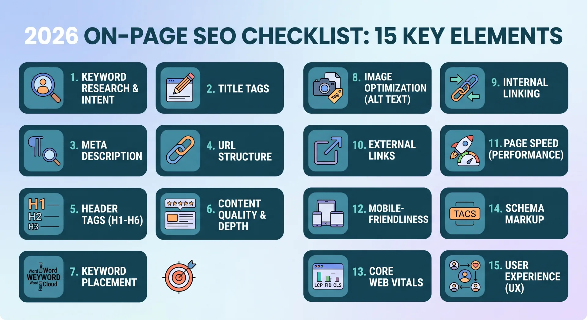
Chapter 6: Automated Mobile Parity Testing in CI/CD Pipelines
Manual testing on a physical iPhone or Android device is essential for qualitative UX evaluations, but enterprise websites publishing dozens or hundreds of pages per week cannot rely on ad-hoc manual spot-checks. Progressive development teams implement automated mobile parity assertions directly inside their continuous integration and deployment (CI/CD) pipelines.
By leveraging headless browser automation engines such as Playwright or Puppeteer, engineering teams can emulate both Googlebot Desktop and Googlebot Smartphone, crawl pull-request preview environments, and assert complete parity across the Document Object Model before any code merges into production.
Production-Grade Python & Playwright DOM Parity Audit Script
Below is a production-ready Python script utilizing Playwright to perform automated differential DOM parity audits between desktop and mobile crawlers:
import asyncio
from playwright.async_api import async_playwright

DESKTOP_UA = "Mozilla/5.0 (compatible; Googlebot/2.1; +http://www.google.com/bot.html)"
MOBILE_UA = "Mozilla/5.0 (Linux; Android 10; K) AppleWebKit/537.36 (KHTML, like Gecko) Chrome/122.0.0.0 Mobile Safari/537.36 (compatible; Googlebot/2.1; +http://www.google.com/bot.html)"

async def audit_mobile_parity(url: str):
    async with async_playwright() as p:
        browser = await p.chromium.launch(headless=True)

        # 1. Desktop Crawl Context
        desktop_ctx = await browser.new_context(
            user_agent=DESKTOP_UA,
            viewport={"width": 1920, "height": 1080}
        )
        desktop_page = await desktop_ctx.new_page()
        await desktop_page.goto(url, wait_until="networkidle")

        desktop_data = await desktop_page.evaluate('''() => ({
            headings: Array.from(document.querySelectorAll('h1, h2, h3')).map(e => e.innerText.trim()),
            links: Array.from(document.querySelectorAll('a[href]')).map(e => e.getAttribute('href')),
            schemas: Array.from(document.querySelectorAll('script[type="application/ld+json"]')).map(e => e.innerText),
            canonical: document.querySelector('link[rel="canonical"]')?.getAttribute('href') || ''
        })''')

        # 2. Mobile Crawl Context (Emulating Googlebot Smartphone)
        mobile_ctx = await browser.new_context(
            user_agent=MOBILE_UA,
            viewport={"width": 390, "height": 844},
            is_mobile=True,
            has_touch=True
        )
        mobile_page = await mobile_ctx.new_page()
        await mobile_page.goto(url, wait_until="networkidle")

        mobile_data = await mobile_page.evaluate('''() => ({
            headings: Array.from(document.querySelectorAll('h1, h2, h3')).map(e => e.innerText.trim()),
            links: Array.from(document.querySelectorAll('a[href]')).map(e => e.getAttribute('href')),
            schemas: Array.from(document.querySelectorAll('script[type="application/ld+json"]')).map(e => e.innerText),
            canonical: document.querySelector('link[rel="canonical"]')?.getAttribute('href') || ''
        })''')

        await browser.close()

        # 3. Parity Assertions
        missing_headings = set(desktop_data['headings']) - set(mobile_data['headings'])
        missing_links = set(desktop_data['links']) - set(mobile_data['links'])

        print(f"=== Parity Audit for: {url} ===")
        print(f"Canonical URL Match: {desktop_data['canonical'] == mobile_data['canonical']}")
        print(f"Schema Script Block Count: Desktop={len(desktop_data['schemas'])}, Mobile={len(mobile_data['schemas'])}")
        print(f"Total Links: Desktop={len(desktop_data['links'])}, Mobile={len(mobile_data['links'])}")

        if missing_headings:
            print(f"CRITICAL WARNING: {len(missing_headings)} Headings missing from Mobile DOM!")
        if missing_links:
            print(f"WARNING: {len(missing_links)} Internal/External links omitted on Mobile viewport!")

# Example execution:
# asyncio.run(audit_mobile_parity("https://seobeen.com/blog/mobile-first-indexing-in-2026-is-your-site-ready"))Integrate this Playwright assertion into your GitHub Actions workflow. If a front-end developer accidentally hides an H2 heading or eliminates contextual internal links inside a mobile template PR, the test fails automatically, preventing indexing regressions from reaching production.
Chapter 7: Enterprise Migration Blueprint: Retiring M-Dot Subdomains
If your enterprise still operates a legacy separated mobile website (e.g., m.example.com), transitioning to a single, unified Responsive Web Design (RWD) architecture is your highest-priority technical undertaking. Maintaining split codebases causes link equity fragmentation, canonical synchronization errors, and double crawl overhead.
The 5-Phase M-Dot to Responsive Migration Framework
Executing an m-dot retirement requires precise edge routing and signal consolidation:
- Phase 1: Comprehensive 1:1 URL Inventory Mapping — Extract all active, legacy, and historical URLs from
m.example.comusing server access logs and crawl exports. Create a strict 1:1 mapping table directing each mobile URL to its exact canonical desktop equivalent (e.g.,https://m.example.com/products/widget→https://example.com/products/widget). Never redirect mobile URLs indiscriminately to the desktop homepage. - Phase 2: Edge-Level 301 Permanent Redirect Implementation — Implement permanent redirects at the CDN or reverse-proxy layer (Cloudflare Workers, Fastly VCL, or Nginx). Edge redirects execute in under 10ms, eliminating client redirect latency.
- Phase 3: Canonical & Alternate Tag Decoupling — Remove all bidirectional annotations: delete
<link rel="alternate" media="only screen and (max-width: 640px)" href="https://m.example.com/...">from desktop pages, and ensure all desktop URLs feature self-referential canonical tags. - Phase 4: Sitemaps & Internal Link Updates — Update your XML sitemaps to include only the canonical responsive URLs. Crawl your internal links and replace all legacy references to the
m.subdomain across headers, footers, body content, and transactional emails. - Phase 5: Search Console Monitoring & Crawl Telemetry — Note that Google Search Console's "Change of Address" tool does not support subdomain-to-domain migrations. Googlebot relies entirely on your 301 HTTP response codes. Monitor crawl stats in GSC for 6 to 12 weeks to confirm Googlebot Smartphone reallocates 100% of crawl activity to the responsive URLs.
Edge Server Nginx Redirect Configuration
Below is an optimized Nginx server block configuration for handling instantaneous, SEO-safe permanent redirection from an m-dot subdomain to the primary responsive domain:
# Server block for legacy m-dot subdomain
server {
    listen 443 ssl http2;
    server_name m.example.com;

    ssl_certificate /etc/letsencrypt/live/example.com/fullchain.pem;
    ssl_certificate_key /etc/letsencrypt/live/example.com/privkey.pem;

    # Strip query parameters if not needed, or preserve them exactly
    # 301 Permanent Redirect to identical URI on root domain
    location / {
        return 301 https://example.com$request_uri;
    }
}| Architecture Model | Implementation Method | Maintenance Overhead | 2026 Google Recommendation |
|---|---|---|---|
| Responsive Web Design (RWD) | Single HTML served to all viewports, adapted via CSS Media Queries | Lowest (Single codebase) | Strongly Recommended (Gold Standard) |
| Dynamic Serving | Same URL serves different HTML based on User-Agent header (Vary: User-Agent) | High (Caching proxy complexities) | Acceptable, but prone to caching errors |
| Separate URLs (M-Dot) | Subdomain (m.example.com) with bidirectional rel="canonical" / rel="alternate" | Extreme (Two full codebases) | Deprecated & Highly Discouraged |
Chapter 8: The 20-Point Pre-Flight Mobile Readiness Scorecard
Before deploying any major template redesign or new application release, run your staging environment through this comprehensive 20-point diagnostic audit:
| # | Audit Checkpoint | Standard Requirement | Status / Verification |
|---|---|---|---|
| 1 | Viewport Meta Tag | <meta name="viewport" content="width=device-width, initial-scale=1"> configured without user-scalable restrictions |
Pass / Mandatory |
| 2 | Text Content Parity | 100% of headings, descriptions, and body copy match desktop verbatim | Pass / Mandatory |
| 3 | Internal Link Parity | All contextual links and breadcrumb navigation present in mobile HTML | Pass / Mandatory |
| 4 | JSON-LD Schema Parity | Identical structured data blocks present in server-rendered mobile HTML | Pass / Mandatory |
| 5 | Canonical Tag Parity | Self-referential canonical tags identical across all device viewports | Pass / Mandatory |
| 6 | Meta Title & Description | Identical SEO meta tags rendered in <head> across devices | Pass / Mandatory |
| 7 | Robots.txt Crawlability | All CSS, JS, font, and image resources unblocked for Googlebot Smartphone | Pass / Mandatory |
| 8 | Hreflang Annotations | International language alternates synchronized without mobile URL drift | Pass / Mandatory |
| 9 | Interaction to Next Paint (INP) | Real-world 75th percentile mobile INP < 200ms | Pass / CWV Signal |
| 10 | Largest Contentful Paint (LCP) | Mobile LCP < 2.5s over cellular network throttled simulation | Pass / CWV Signal |
| 11 | Cumulative Layout Shift (CLS) | Mobile CLS score < 0.1 throughout entire user scrolling session | Pass / CWV Signal |
| 12 | Hero Image Preloading | Mobile LCP hero image preloaded with fetchpriority="high" |
Pass / Speed Best Practice |
| 13 | Hero Lazy-Loading Check | No loading="lazy" attribute on above-the-fold viewport images |
Pass / Speed Best Practice |
| 14 | Modern Responsive Images | WebP or AVIF served via <picture> or srcset with explicit width and height | Pass / Speed Best Practice |
| 15 | Touch Target Dimensions | Interactive elements occupy at least 48x48 CSS pixels with 8px margin | Pass / Usability Signal |
| 16 | Font Legibility Threshold | Primary copy ≥ 16px to prevent automatic zooming on iOS Safari inputs | Pass / Usability Signal |
| 17 | No Horizontal Scrollbar | No content exceeds viewport width (zero horizontal scroll overflow at 360px) | Pass / Usability Signal |
| 18 | Interstitial Compliance | No intrusive popups obscuring content on initial mobile page entry | Pass / Algorithmic Penalty Avoided |
| 19 | Server Response Time (TTFB) | Time to First Byte under 400ms globally via edge CDN caching | Pass / Speed Best Practice |
| 20 | GSC Live URL Inspection | 100% of assets rendered cleanly in Google Search Console's "Test Live URL" | Pass / Final Sign-Off |
Frequently Asked Questions (FAQ)
What is Mobile-First Indexing?
Mobile-First Indexing means Google predominantly uses the mobile version of a website's content for indexing and ranking. Rather than crawling a desktop version and using that to judge search relevance, Googlebot Smartphone crawls your mobile templates to build its primary index, evaluate entities, and determine search positions for both desktop and mobile searchers.
Does Google still crawl with a desktop crawler?
While Googlebot Desktop still exists, it is now relegated to secondary tasks, such as occasional desktop-specific feature verification or checking desktop-only site configurations. It is no longer used to establish your site's primary organic search rankings or index new web content.
Why is my mobile PageSpeed score significantly lower than my desktop score?
PageSpeed Insights simulates mobile tests using a throttled mid-tier mobile processor (equivalent to a Moto G4 or similar) on a simulated 4G cellular network. Desktop tests run on unthrottled desktop hardware with high-speed bandwidth. Mobile scores drop due to heavy JavaScript execution that overloads the mobile CPU and uncompressed image assets that lag over cellular latency.
What should an enterprise do if it still operates an m-dot (m.example.com) website?
Plan an immediate permanent migration to a single Responsive Web Design (RWD) architecture. Implement 301 permanent redirects from all m.example.com URLs to their corresponding desktop counterparts, update canonical tags, remove bidirectional alternate annotations, and verify that the unified responsive templates pass all DOM parity audits.
How does Interaction to Next Paint (INP) impact Mobile-First Indexing?
INP is a confirmed Core Web Vitals ranking factor that measures interactive latency across the entire user session. While poor INP does not prevent Googlebot from crawling your pages, it directly degrades your page experience ranking score. A mobile INP exceeding 200ms signals to Google that your website is sluggish and unresponsive, leading to demotion in competitive mobile SERPs.
Are mobile breadcrumbs and internal links evaluated the same as desktop?
Yes. In fact, because Google indexes exclusively from the mobile viewpoint, your mobile internal link structure is the ONLY link structure that passes PageRank equity across your domain. If you hide breadcrumb trails, footer navigation links, or sidebar contextual links on mobile templates, those links stop passing SEO authority across your entire website.
Can a site rank on desktop if it is not mobile-friendly?
Technically, a non-mobile-friendly site can still appear in desktop search results if it possesses immense topical authority and unique content that no competitor matches. However, its rankings will be severely suppressed by Google's Page Experience algorithms, and it will lose virtually all mobile search traffic—which accounts for the vast majority of global queries.
How can developers test how Googlebot Smartphone sees their web pages?
The definitive tool is the URL Inspection Tool inside Google Search Console. Click "Test Live URL" and select "View Tested Page". This displays the exact rendered HTML DOM, a full-resolution screenshot captured by Googlebot Smartphone, and a list of all resources (stylesheets, scripts, images) that failed to load during crawler rendering.
Does mobile-first indexing apply to images and videos?
Yes. Googlebot Smartphone indexes images and videos exclusively from the mobile version of your page. Ensure that mobile templates include high-quality images with descriptive alt tags, that videos are embedded with visible HTML5 <video> tags or responsive iframe wrappers, and that video schema markup is fully present on mobile viewports.
What is the impact of intrusive mobile popups on SEO rankings?
Google enforces an explicit Intrusive Interstitial Penalty on mobile search. Any modal popup, subscription overlay, or full-screen banner that covers the main content immediately after landing—or while the user scrolls—degrades your mobile ranking signals. Legal notices (cookie consent, age verification) and subtle banners occupying under 20% of screen height are exempt.
Conclusion: The Mobile-First Imperative in 2026
Mobile-First Indexing is not a separate discipline within search engine optimization; it is search engine optimization. In 2026, the performance, structure, and accessibility of your mobile website establish the absolute ceiling of your organic search success.
The organizations that dominate organic search in 2026 do not view mobile as an adapted, stripped-down version of their desktop website. They architect their digital infrastructure mobile-first: maintaining complete DOM parity, eliminating JavaScript hydration bottlenecks, engineering sub-200ms INP responsiveness, and ensuring every entity, schema annotation, and internal link renders flawlessly on the smallest screens.
Execute the 20-point diagnostic scorecard, audit your mobile templates through Googlebot Smartphone's viewport, and ensure your web infrastructure is engineered to conquer the mobile-only future.

Ratings & reviews
No reviews yet. Be the first.